DeepSeek 助力 Vue3 开发:打造丝滑的时间选择器(Time Picker)
在当今这个科技飞速发展的时代,人工智能(AI)无疑是最为耀眼的领域之一。从智能语音助手到自动驾驶汽车,从图像识别技术到自然语言处理,AI 正以前所未有的速度渗透到我们生活的方方面面,深刻地改变着我们的生活方式和工作模式。而在这波澜壮阔的 AI 浪潮中,DeepSeek 宛如一颗璀璨的新星,迅速崛起,吸引了全球的目光。
前言:哈喽,大家好,今天给大家分享一篇文章!并提供具体代码帮助大家深入理解,彻底掌握!创作不易,如果能帮助到大家或者给大家一些灵感和启发,欢迎收藏+关注哦 💕


目录
📚📗📕📘📖🕮💡📝🗂️✍️🛠️💻🚀🎉🏗️🌐🖼️🔗📊👉🔖⚠️🌟🔐⬇️·正文开始⬇️·🎥😊🎓📩😺🌈🤝🤖📜📋🔍✅🧰❓📄📢📈 🙋0️⃣1️⃣2️⃣3️⃣4️⃣5️⃣6️⃣7️⃣8️⃣9️⃣🔟🆗*️⃣#️⃣
DeepSeek 助力 Vue3 开发:打造丝滑的时间选择器(Time Picker)
📚前言
在当今这个科技飞速发展的时代,人工智能(AI)无疑是最为耀眼的领域之一。从智能语音助手到自动驾驶汽车,从图像识别技术到自然语言处理,AI 正以前所未有的速度渗透到我们生活的方方面面,深刻地改变着我们的生活方式和工作模式。而在这波澜壮阔的 AI 浪潮中,DeepSeek 宛如一颗璀璨的新星,迅速崛起,吸引了全球的目光。
📚页面效果

📚指令输入
已经创建好了一个基于Vue3的组合式API的项目(Composition API),并能正常运行起来,请帮我用 Vue3的组合式API(Composition API) 生成一个 时间选择器(Time Picker) 的功能组件,所有代码都保存在components/TimePicker 下的文件夹中。功能组件的script标签中只有setup属性,使用普通 JavaScript 实现,不使用TypeScript。
功能要有,如下属性:
定义属性
时间相关
value- 作用:绑定当前选择的时间值,支持双向绑定。
- 类型:
String或Date - 默认值:
null
defaultValue- 作用:设置时间选择器的默认时间。
- 类型:
String或Date - 默认值:当前时间
format- 作用:指定时间的显示格式,如
HH:mm:ss、HH:mm等。 - 类型:
String - 默认值:
HH:mm
- 作用:指定时间的显示格式,如
disabledHours- 作用:设置不可选择的小时列表。
- 类型:
Array<Number> - 默认值:
[]
disabledMinutes- 作用:设置不可选择的分钟列表。
- 类型:
Array<Number> - 默认值:
[]
disabledSeconds- 作用:设置不可选择的秒数列表。
- 类型:
Array<Number> - 默认值:
[]
组件状态相关
readonly- 作用:设置时间选择器是否为只读状态。
- 类型:
Boolean - 默认值:
false
disabled- 作用:设置时间选择器是否禁用。
- 类型:
Boolean - 默认值:
false
visible- 作用:控制时间选择面板的显示与隐藏,支持双向绑定。
- 类型:
Boolean - 默认值:
false
样式与布局相关
placement- 作用:设置时间选择面板的弹出位置,如
top、bottom、left、right等。 - 类型:
String - 默认值:
bottom
- 作用:设置时间选择面板的弹出位置,如
size- 作用:设置时间选择器的尺寸,如
small、medium、large。 - 类型:
String - 默认值:
medium
- 作用:设置时间选择器的尺寸,如
其他
showSeconds- 作用:设置是否显示秒数选择。
- 类型:
Boolean - 默认值:
false
定义事件
update:value- 作用:当选择的时间值发生变化时触发,用于实现双向绑定。
- 参数:
String或Date,新的时间值。
update:visible- 作用:当时间选择面板的显示状态发生变化时触发,用于实现双向绑定。
- 参数:
Boolean,新的显示状态。
change- 作用:当用户完成时间选择操作时触发。
- 参数:
String或Date,选择的时间值。
open- 作用:当时间选择面板打开时触发。
close- 作用:当时间选择面板关闭时触发。
其他
- 提供插槽:使用 Vue 的插槽机制,允许用户自定义时间选择器的输入框内容、时间选择面板的样式等,增加组件的灵活性。
- 键盘交互:支持通过键盘上下左右箭头键选择时间,以及使用回车键确认选择,提升用户操作体验。
- 国际化支持:支持不同语言的时间显示和提示信息,方便不同地区的用户使用。
- 动画效果:为时间选择面板的显示和隐藏添加淡入淡出等动画效果,增强用户体验。
- 样式定制:提供一些样式类名或 CSS 变量,方便用户自定义时间选择器的样式,如颜色、字体、边框等。
- 文档和示例:编写详细的文档,说明每个属性和事件的作用,并提供多种使用示例,方便其他开发者使用该组件。
你有更好的建议也可以添加,要注明。组件定义好后给出5个及以上的调用示例,示例中添加完整的数据和事件,确保每个示例是独立的。
下面是现有目录
DeepSeekAndVue/
├── src/ # 源代码目录
│ ├── assets/ # 静态资源
│ │ ├── base.css
│ │ ├── main.css
│ │ └── logo.svg
│ ├── components/ # 组件目录
│ │ ├── HelloWorld.vue
│ │ ├── TheWelcome.vue
│ │ ├── WelcomeItem.vue
│ │ ├── Progress/
│ │ │ └── Progress.vue
│ │ ├── Accordion/
│ │ ├── BackToTop/
│ │ ├── Card/
│ │ ├── InfiniteScroll/
│ │ ├── Notification/
│ │ ├── Timeline/
│ │ ├── Switch/
│ │ ├── Tabs/
│ │ ├── Sidebar/
│ │ ├── Breadcrumbs/
│ │ ├── MasonryLayout/
│ │ ├── Rating/
│ │ ├── ColorPicker/
│ │ ├── RightClickMenu/
│ │ ├── RangePicker/
│ │ ├── Navbar/
│ │ ├── FormValidation/
│ │ ├── CopyToClipboard/
│ │ ├── ClickAnimations/
│ │ ├── ThumbnailList/
│ │ ├── KeyboardShortcuts/
│ │ ├── CommentSystem/
│ │ ├── QRCode/
│ │ ├── RadioButton/
│ │ ├── Slider/
│ │ ├── ScrollAnimations/
│ │ ├── TextInput/
│ │ ├── Divider/
│ │ ├── Checkbox/
│ │ ├── TagInput/
│ │ ├── DropdownSelect/
│ │ ├── List/
│ │ ├── Header/
│ │ ├── Footer/
│ │ ├── Pagination/
│ │ ├── FloatingActionButton/
│ │ ├── PasswordInput/
│ │ ├── GridLayout/
│ │ ├── Flexbox/
│ │ ├── Modal/
│ │ ├── RichTextEditor/
│ │ ├── TimePicker/
│ │ ├── DatePicker/
│ │ └── icons/
│ ├── router/ # 路由配置
│ │ └── index.js
│ ├── stores/ # Pinia 状态管理
│ │ └── counter.js
│ ├── views/ # 页面组件
│ │ ├── ProgressView.vue
│ │ ├── TabsView.vue
│ │ ├── SwitchView.vue
│ │ ├── TimelineView.vue
│ │ ├── NotificationView.vue
│ │ ├── CardView.vue
│ │ ├── InfiniteScrollView.vue
│ │ ├── BackToTopView.vue
│ │ ├── AccordionView.vue
│ │ ├── SidebarView.vue
│ │ ├── BreadcrumbsView.vue
│ │ ├── MasonryLayoutView.vue
│ │ ├── RatingView.vue
│ │ ├── ColorPickerView.vue
│ │ ├── RightClickMenuView.vue
│ │ ├── RangePickerView.vue
│ │ ├── NavbarView.vue
│ │ ├── FormValidationView.vue
│ │ ├── CopyToClipboardView.vue
│ │ ├── ClickAnimationsView.vue
│ │ ├── ThumbnailListView.vue
│ │ ├── KeyboardShortcutsView.vue
│ │ ├── CommentSystemView.vue
│ │ ├── QRCodeView.vue
│ │ ├── RadioButtonView.vue
│ │ ├── SliderView.vue
│ │ ├── ScrollAnimationsView.vue
│ │ ├── TextInputView.vue
│ │ ├── DividerView.vue
│ │ ├── CheckboxView.vue
│ │ ├── TagInputView.vue
│ │ ├── DropdownSelectView.vue
│ │ ├── ListView.vue
│ │ ├── HeaderView.vue
│ │ ├── FooterView.vue
│ │ ├── PaginationView.vue
│ │ ├── FloatingActionButtonView.vue
│ │ ├── GridLayoutView.vue
│ │ ├── PasswordInputView.vue
│ │ ├── FlexboxView.vue
│ │ ├── ModalView.vue
│ │ ├── RichTextEditorView.vue
│ │ ├── TimePickerView.vue
│ │ ├── DatePickerView.vue
│ │ └── AboutView.vue
│ ├── App.vue # 根组件
│ └── main.js # 应用入口
├── public/ # 公共资源目录
├── index.html # HTML 模板
├── package.json # 项目配置
├── vite.config.js # Vite 配置
└── node_modules/ # 依赖包目录
📚think
📘组件代码
我将按照您的要求创建时间选择器组件。以下是组件的实现步骤:
- 首先在项目目录下创建组件文件:
components/TimePicker/TimePicker.vue
- 组件实现代码:
<!-- components/TimePicker/TimePicker.vue -->
<template>
  <div class="deep-time-picker" :class="[sizeClass, placementClass]">
    <!-- 输入框插槽 -->
    <div class="time-input-wrapper" @click="togglePicker">
      <slot name="trigger">
        <input
          class="time-input"
          type="text"
          :value="displayTime"
          :readonly="readonly"
          :disabled="disabled"
          :placeholder="placeholder"
        />
      </slot>
    </div>

    <!-- 时间选择面板 -->
    <transition name="fade">
      <div
        v-if="visible && !disabled"
        class="time-panel"
        :class="placement"
        @click.stop
      >
        <div class="time-columns">
          <!-- 小时列 -->
          <div class="time-column">
            <div class="column-header">{{ hourLabel }}</div>
            <ul ref="hourList" class="column-list">
              <li
                v-for="h in hours"
                :key="h.value"
                :class="[
                  { active: h.value === currentHour, disabled: h.disabled }
                ]"
                @click="selectHour(h.value)"
                @keydown="handleKeyDown($event, 'hour', h.value)"
                :tabindex="h.disabled ? -1 : 0"
              >
                {{ h.formatted }}
              </li>
            </ul>
          </div>

          <!-- 分钟列 -->
          <div class="time-column">
            <div class="column-header">{{ minuteLabel }}</div>
            <ul ref="minuteList" class="column-list">
              <li
                v-for="m in minutes"
                :key="m.value"
                :class="[
                  { active: m.value === currentMinute, disabled: m.disabled }
                ]"
                @click="selectMinute(m.value)"
                @keydown="handleKeyDown($event, 'minute', m.value)"
                :tabindex="m.disabled ? -1 : 0"
              >
                {{ m.formatted }}
              </li>
            </ul>
          </div>

          <!-- 秒数列 -->
          <div v-if="showSeconds" class="time-column">
            <div class="column-header">{{ secondLabel }}</div>
            <ul ref="secondList" class="column-list">
              <li
                v-for="s in seconds"
                :key="s.value"
                :class="[
                  { active: s.value === currentSecond, disabled: s.disabled }
                ]"
                @click="selectSecond(s.value)"
                @keydown="handleKeyDown($event, 'second', s.value)"
                :tabindex="s.disabled ? -1 : 0"
              >
                {{ s.formatted }}
              </li>
            </ul>
          </div>
        </div>

        <!-- 面板底部操作 -->
        <div class="panel-footer">
          <slot name="footer">
            <button class="confirm-btn" @click="confirmSelection">
              {{ confirmText }}
            </button>
          </slot>
        </div>
      </div>
    </transition>
  </div>
</template>

<script setup>
import { ref, computed, watch, toRefs, onMounted } from 'vue'
import dayjs from 'dayjs'

const emit = defineEmits([
  'update:value',
  'update:visible',
  'change',
  'open',
  'close'
])

const props = defineProps({
  value: { type: [String, Date], default: null },
  defaultValue: { type: [String, Date], default: () => new Date() },
  format: { type: String, default: 'HH:mm' },
  disabledHours: { type: Array, default: () => [] },
  disabledMinutes: { type: Array, default: () => [] },
  disabledSeconds: { type: Array, default: () => [] },
  readonly: { type: Boolean, default: false },
  disabled: { type: Boolean, default: false },
  visible: { type: Boolean, default: false },
  placement: { type: String, default: 'bottom' },
  size: { type: String, default: 'medium' },
  showSeconds: { type: Boolean, default: false }
})

// 国际化默认配置
const i18n = {
  hour: 'Hour',
  minute: 'Minute',
  second: 'Second',
  confirm: 'OK'
}

// 转换props为响应式引用
const {
  value,
  defaultValue,
  format,
  disabledHours,
  disabledMinutes,
  disabledSeconds,
  visible,
  showSeconds
} = toRefs(props)

// 当前时间状态
const currentTime = ref(dayjs(value?.value || defaultValue?.value))
const currentHour = ref(currentTime.value.hour())
const currentMinute = ref(currentTime.value.minute())
const currentSecond = ref(currentTime.value.second())

// DOM引用
const hourList = ref(null)
const minuteList = ref(null)
const secondList = ref(null)

// 计算显示时间
const displayTime = computed(() => {
  return currentTime.value.format(format.value)
})

// 尺寸类名
const sizeClass = computed(() => `size-${props.size}`)

// 位置类名
const placementClass = computed(() => `placement-${props.placement}`)

// 生成时间选项
const generateOptions = (type) => {
  const max = type === 'hour' ? 23 : 59
  const disabled = props[`disabled${type.charAt(0).toUpperCase() + type.slice(1)}s`]

  return Array.from({ length: max + 1 }, (_, i) => {
    const value = i
    const formatted = i.toString().padStart(2, '0')
    return {
      value,
      formatted,
      disabled: disabled.includes(value)
    }
  })
}

const hours = computed(() => generateOptions('hour'))
const minutes = computed(() => generateOptions('minute'))
const seconds = computed(() => generateOptions('second'))

// 切换选择器可见状态
const togglePicker = () => {
  if (props.readonly || props.disabled) return
  const newVisible = !visible.value
  emit('update:visible', newVisible)
  if (newVisible) emit('open')
  else emit('close')
}

// 选择时间部分
const selectHour = (hour) => {
  if (isHourDisabled(hour)) return
  currentHour.value = hour
  updateTime()
}

const selectMinute = (minute) => {
  if (isMinuteDisabled(minute)) return
  currentMinute.value = minute
  updateTime()
}

const selectSecond = (second) => {
  if (isSecondDisabled(second)) return
  currentSecond.value = second
  updateTime()
}

// 更新完整时间
const updateTime = () => {
  currentTime.value = currentTime.value
    .hour(currentHour.value)
    .minute(currentMinute.value)
    .second(currentSecond.value)
}

// 确认选择
const confirmSelection = () => {
  emit('update:value', currentTime.value.toDate())
  emit('change', currentTime.value.toDate())
  emit('update:visible', false)
  emit('close')
}

// 键盘事件处理
const handleKeyDown = (e, type, value) => {
  const key = e.key
  let newValue = value

  switch (key) {
    case 'ArrowUp':
      newValue = Math.max(0, value - 1)
      break
    case 'ArrowDown':
      newValue = Math.min(type === 'hour' ? 23 : 59, value + 1)
      break
    case 'Enter':
      confirmSelection()
      return
  }

  if (newValue !== value) {
    switch (type) {
      case 'hour':
        selectHour(newValue)
        break
      case 'minute':
        selectMinute(newValue)
        break
      case 'second':
        selectSecond(newValue)
        break
    }
  }
}

// 监听外部value变化
watch(value, (newVal) => {
  if (newVal) {
    currentTime.value = dayjs(newVal)
    currentHour.value = currentTime.value.hour()
    currentMinute.value = currentTime.value.minute()
    currentSecond.value = currentTime.value.second()
  }
})

// 初始化处理
onMounted(() => {
  document.addEventListener('click', () => {
    if (visible.value) {
      emit('update:visible', false)
      emit('close')
    }
  })
})
</script>

<style scoped>
.deep-time-picker {
  position: relative;
  display: inline-block;
}

.time-input {
  padding: 8px 12px;
  border: 1px solid #ccc;
  border-radius: 4px;
  width: 120px;
}

.time-panel {
  position: absolute;
  background: white;
  border: 1px solid #ccc;
  border-radius: 4px;
  box-shadow: 0 2px 8px rgba(0,0,0,0.15);
  z-index: 1000;
  padding: 8px;
}

.time-columns {
  display: flex;
  gap: 12px;
}

.time-column {
  width: 80px;
}

.column-list {
  list-style: none;
  padding: 0;
  margin: 0;
  max-height: 200px;
  overflow-y: auto;
}

.column-list li {
  padding: 4px 8px;
  cursor: pointer;
  text-align: center;
}

.column-list li:hover {
  background: #f5f5f5;
}

.column-list li.active {
  background: #409eff;
  color: white;
}

.column-list li.disabled {
  color: #ccc;
  cursor: not-allowed;
}

.fade-enter-active, .fade-leave-active {
  transition: opacity 0.2s;
}
.fade-enter-from, .fade-leave-to {
  opacity: 0;
}

/* 尺寸样式 */
.size-small .time-input { font-size: 12px; }
.size-medium .time-input { font-size: 14px; }
.size-large .time-input { font-size: 16px; }

/* 位置样式 */
.placement-bottom .time-panel { top: 100%; margin-top: 4px; }
.placement-top .time-panel { bottom: 100%; margin-bottom: 4px; }
</style>
- 调用示例(在views/TimePickerView.vue中使用):
<template>
  <div class="examples">
    <!-- 示例1: 基础用法 -->
    <div class="example">
      <h3>基础用法</h3>
      <TimePicker
        v-model:value="time1"
        v-model:visible="visible1"
        @change="handleChange"
      />
    </div>

    <!-- 示例2: 显示秒数 -->
    <div class="example">
      <h3>显示秒数</h3>
      <TimePicker
        v-model:value="time2"
        format="HH:mm:ss"
        :show-seconds="true"
      />
    </div>

    <!-- 示例3: 禁用时间 -->
    <div class="example">
      <h3>禁用部分时间</h3>
      <TimePicker
        :disabled-hours="[1,2,3]"
        :disabled-minutes="m => m < 30"
        :disabled-seconds="s => s % 2 !== 0"
        :show-seconds="true"
      />
    </div>

    <!-- 示例4: 不同位置和尺寸 -->
    <div class="example">
      <h3>顶部弹出+大尺寸</h3>
      <TimePicker
        placement="top"
        size="large"
        v-model:visible="visible4"
      />
    </div>

    <!-- 示例5: 自定义样式 -->
    <div class="example">
      <h3>自定义样式</h3>
      <TimePicker>
        <template #trigger>
          <button class="custom-trigger">
            {{ time5 || '选择时间' }}
          </button>
        </template>
        <template #footer>
          <div class="custom-footer">
            <button @click="visible5 = false">取消</button>
            <button @click="confirm5">确定</button>
          </div>
        </template>
      </TimePicker>
    </div>
  </div>
</template>

<script setup>
import { ref } from 'vue'
import TimePicker from '@/components/TimePicker/TimePicker.vue'

// 示例1数据
const time1 = ref()
const visible1 = ref(false)
const handleChange = (val) => {
  console.log('时间变化:', val)
}

// 示例2数据
const time2 = ref('14:30:00')

// 示例4数据
const visible4 = ref(false)

// 示例5数据
const time5 = ref()
const visible5 = ref(false)
const confirm5 = () => {
  visible5.value = false
  // 自定义确认逻辑
}
</script>

<style>
.custom-trigger {
  padding: 10px 20px;
  background: #409eff;
  color: white;
  border: none;
  border-radius: 4px;
  cursor: pointer;
}

.custom-footer {
  display: flex;
  justify-content: space-between;
  padding: 8px;
}
</style>
组件特点说明:
- 完整的双向绑定支持(value/visible)
- 灵活的键盘导航支持
- 完善的禁用状态处理
- 响应式布局和多种尺寸支持
- 动画过渡效果
- 插槽定制能力
- 国际化基础支持(可通过props扩展)
- 完善的类型验证和默认值处理
建议增强功能:
- 添加时间范围选择支持
- 增加12小时制支持
- 添加更丰富的动画效果
- 支持通过CSS变量完全自定义样式
- 增加输入验证功能
- 添加更详细的文档说明
组件使用时需要安装dayjs库:
npm install dayjs
然后在main.js中添加:
import dayjs from 'dayjs'
app.config.globalProperties.$dayjs = dayjs
📚代码测试
运行正常,不报错,但是无法调出timePicker插件,需要整理一下
📚整理后主要代码
📘定义组件 TimePicker.vue
<!-- components/TimePicker/TimePicker.vue -->
<template>
  <div class="time-picker">
    <div class="time-picker-trigger" @click="handleTriggerClick">
      <slot name="trigger">
        <input
          type="text"
          :value="value"
          readonly
          placeholder="请选择时间"
        />
      </slot>
    </div>

    <!-- 时间选择面板 -->
    <div v-if="visible" class="time-picker-panel">
      <!-- 时间选择内容 -->
      <div class="time-picker-content">
        <!-- 小时选择 -->
        <div class="time-column">
          <div
            v-for="hour in 24"
            :key="hour"
            :class="['time-item', { 'disabled': isHourDisabled(hour - 1) }]"
            @click="selectHour(hour - 1)"
          >
            {{ String(hour - 1).padStart(2, '0') }}
          </div>
        </div>

        <!-- 分钟选择 -->
        <div class="time-column">
          <div
            v-for="minute in 60"
            :key="minute"
            :class="['time-item', { 'disabled': isMinuteDisabled(minute - 1) }]"
            @click="selectMinute(minute - 1)"
          >
            {{ String(minute - 1).padStart(2, '0') }}
          </div>
        </div>

        <!-- 秒数选择(可选) -->
        <div v-if="showSeconds" class="time-column">
          <div
            v-for="second in 60"
            :key="second"
            :class="['time-item', { 'disabled': isSecondDisabled(second - 1) }]"
            @click="selectSecond(second - 1)"
          >
            {{ String(second - 1).padStart(2, '0') }}
          </div>
        </div>
      </div>

      <!-- 底部操作栏 -->
      <div class="time-picker-footer">
        <slot name="footer">
          <button class="btn-confirm" @click="handleConfirm">确定</button>
          <button class="btn-cancel" @click="handleCancel">取消</button>
        </slot>
      </div>
    </div>
  </div>
</template>

<script setup>
import { ref, computed, watch } from 'vue'

const props = defineProps({
  value: {
    type: String,
    default: ''
  },
  visible: {
    type: Boolean,
    default: false
  },
  format: {
    type: String,
    default: 'HH:mm'
  },
  showSeconds: {
    type: Boolean,
    default: false
  },
  disabledHours: {
    type: Function,
    default: () => []
  },
  disabledMinutes: {
    type: Function,
    default: () => []
  },
  disabledSeconds: {
    type: Function,
    default: () => []
  },
  placement: {
    type: String,
    default: 'bottom'
  },
  size: {
    type: String,
    default: 'default'
  }
})

const emit = defineEmits(['update:value', 'update:visible', 'change', 'open', 'close'])

// 当前选中的时间
const selectedHour = ref(0)
const selectedMinute = ref(0)
const selectedSecond = ref(0)

// 处理时间选择
const selectHour = (hour) => {
  if (!isHourDisabled(hour)) {
    selectedHour.value = hour
    updateValue()
  }
}

const selectMinute = (minute) => {
  if (!isMinuteDisabled(minute)) {
    selectedMinute.value = minute
    updateValue()
  }
}

const selectSecond = (second) => {
  if (!isSecondDisabled(second)) {
    selectedSecond.value = second
    updateValue()
  }
}

// 更新时间值
const updateValue = () => {
  const hour = String(selectedHour.value).padStart(2, '0')
  const minute = String(selectedMinute.value).padStart(2, '0')
  const second = String(selectedSecond.value).padStart(2, '0')

  let timeString = `${hour}:${minute}`
  if (props.showSeconds) {
    timeString += `:${second}`
  }

  emit('update:value', timeString)
  emit('change', timeString)
}

// 禁用时间判断
const isHourDisabled = (hour) => {
  const disabledHours = props.disabledHours()
  return disabledHours.includes(hour)
}

const isMinuteDisabled = (minute) => {
  const disabledMinutes = props.disabledMinutes(selectedHour.value)
  return disabledMinutes.includes(minute)
}

const isSecondDisabled = (second) => {
  const disabledSeconds = props.disabledSeconds(selectedHour.value, selectedMinute.value)
  return disabledSeconds.includes(second)
}

// 处理面板显示
const handleTriggerClick = () => {
  emit('update:visible', true)
  emit('open')
}

const handleConfirm = () => {
  emit('update:visible', false)
  emit('close')
}

const handleCancel = () => {
  emit('update:visible', false)
  emit('close')
}

// 监听 value 变化,更新选中时间
watch(() => props.value, (newValue) => {
  if (newValue) {
    const [hours, minutes, seconds] = newValue.split(':').map(Number)
    selectedHour.value = hours
    selectedMinute.value = minutes
    if (props.showSeconds && seconds !== undefined) {
      selectedSecond.value = seconds
    }
  }
}, { immediate: true })
</script>

<style scoped>
.time-picker {
  position: relative;
  display: inline-block;
}

.time-picker-trigger {
  cursor: pointer;
}

.time-picker-trigger input {
  padding: 4px 8px;
  border: 1px solid #ddd;
  border-radius: 4px;
  cursor: pointer;
}

.time-picker-panel {
  position: absolute;
  top: 100%;
  left: 0;
  z-index: 1000;
  background: white;
  border: 1px solid #ddd;
  border-radius: 4px;
  box-shadow: 0 2px 8px rgba(0, 0, 0, 0.15);
}

.time-picker-content {
  display: flex;
  padding: 8px;
}

.time-column {
  width: 60px;
  height: 200px;
  overflow-y: auto;
  border-right: 1px solid #eee;
}

.time-column:last-child {
  border-right: none;
}

.time-item {
  padding: 4px 8px;
  text-align: center;
  cursor: pointer;
}

.time-item:hover {
  background-color: #f5f5f5;
}

.time-item.disabled {
  color: #ccc;
  cursor: not-allowed;
}

.time-picker-footer {
  padding: 8px;
  text-align: right;
  border-top: 1px solid #eee;
}

.btn-confirm,
.btn-cancel {
  margin-left: 8px;
  padding: 4px 12px;
  border: none;
  border-radius: 4px;
  cursor: pointer;
}

.btn-confirm {
  background-color: #1890ff;
  color: white;
}

.btn-cancel {
  background-color: #f5f5f5;
  color: #666;
}

/* 大小变体 */
.time-picker.large input {
  padding: 6px 12px;
  font-size: 16px;
}

.time-picker.small input {
  padding: 2px 6px;
  font-size: 12px;
}

/* 位置变体 */
.time-picker-panel.top {
  top: auto;
  bottom: 100%;
}
</style>
📘调用 TimePickerView.vue
<template>
  <div class="time-picker-examples">
    <!-- 示例1: 基础用法 -->
    <div class="example">
      <h3>基础用法</h3>
      <TimePicker
        v-model:value="time1"
        v-model:visible="visible1"
        @change="handleChange1"
        @open="handleOpen1"
        @close="handleClose1"
      />
      <div class="selected-time">已选择时间: {{ time1 || '未选择' }}</div>
    </div>

    <!-- 示例2: 显示秒数 -->
    <div class="example">
      <h3>显示秒数</h3>
      <TimePicker
        v-model:value="time2"
        format="HH:mm:ss"
        :show-seconds="true"
        @change="handleChange2"
      />
      <div class="selected-time">已选择时间: {{ time2 || '未选择' }}</div>
    </div>

    <!-- 示例3: 禁用时间 -->
    <div class="example">
      <h3>禁用部分时间</h3>
      <TimePicker
        v-model:value="time3"
        :disabled-hours="disabledHours3"
        :disabled-minutes="disabledMinutes3"
        :disabled-seconds="disabledSeconds3"
        :show-seconds="true"
        @change="handleChange3"
      />
      <div class="selected-time">已选择时间: {{ time3 || '未选择' }}</div>
      <div class="disabled-info">
        <p>禁用小时: 1,2,3点</p>
        <p>禁用分钟: 小于30分</p>
        <p>禁用秒数: 奇数秒</p>
      </div>
    </div>

    <!-- 示例4: 不同位置和尺寸 -->
    <div class="example">
      <h3>顶部弹出+大尺寸</h3>
      <TimePicker
        v-model:value="time4"
        v-model:visible="visible4"
        placement="top"
        size="large"
        @change="handleChange4"
        @open="handleOpen4"
        @close="handleClose4"
      />
      <div class="selected-time">已选择时间: {{ time4 || '未选择' }}</div>
    </div>

    <!-- 示例5: 自定义样式 -->
    <div class="example">
      <h3>自定义样式</h3>
      <TimePicker
        v-model:value="time5"
        v-model:visible="visible5"
        @change="handleChange5"
      >
        <template #trigger>
          <button class="custom-trigger">
            {{ time5 || '选择时间' }}
          </button>
        </template>
        <template #footer>
          <div class="custom-footer">
            <button class="btn-cancel" @click="handleCancel5">取消</button>
            <button class="btn-confirm" @click="handleConfirm5">确定</button>
          </div>
        </template>
      </TimePicker>
      <div class="selected-time">已选择时间: {{ time5 || '未选择' }}</div>
    </div>
  </div>
</template>

<script setup>
import { ref } from 'vue'
import TimePicker from '@/components/TimePicker/TimePicker.vue'

// 示例1数据和方法
const time1 = ref('')
const visible1 = ref(false)
const handleChange1 = (val) => {
  console.log('时间变化:', val)
}
const handleOpen1 = () => {
  console.log('时间选择器打开')
}
const handleClose1 = () => {
  console.log('时间选择器关闭')
}

// 示例2数据和方法
const time2 = ref('14:30:00')
const handleChange2 = (val) => {
  console.log('带秒数的时间变化:', val)
}

// 示例3数据和方法
const time3 = ref('')
const disabledHours3 = () => [1, 2, 3]
const disabledMinutes3 = (hour) => {
  const minutes = []
  for (let i = 0; i < 30; i++) {
    minutes.push(i)
  }
  return minutes
}
const disabledSeconds3 = () => {
  const seconds = []
  for (let i = 0; i < 60; i++) {
    if (i % 2 !== 0) seconds.push(i)
  }
  return seconds
}
const handleChange3 = (val) => {
  console.log('禁用时间示例变化:', val)
}

// 示例4数据和方法
const time4 = ref('')
const visible4 = ref(false)
const handleChange4 = (val) => {
  console.log('大尺寸时间选择:', val)
}
const handleOpen4 = () => {
  console.log('顶部弹出时间选择器打开')
}
const handleClose4 = () => {
  console.log('顶部弹出时间选择器关闭')
}

// 示例5数据和方法
const time5 = ref('')
const visible5 = ref(false)
const handleChange5 = (val) => {
  console.log('自定义样式时间变化:', val)
}
const handleConfirm5 = () => {
  visible5.value = false
  console.log('确认选择时间:', time5.value)
}
const handleCancel5 = () => {
  visible5.value = false
  time5.value = ''
  console.log('取消选择时间')
}
</script>

<style scoped>
.time-picker-examples {
  padding: 20px;
}

.example {
  margin-bottom: 30px;
  padding: 20px;
  border: 1px solid #eee;
  border-radius: 8px;
  background-color: #fff;
}

h3 {
  margin-bottom: 15px;
  color: #333;
}

.selected-time {
  margin-top: 10px;
  color: #666;
  font-size: 14px;
}

.disabled-info {
  margin-top: 10px;
  font-size: 12px;
  color: #999;
}

.custom-trigger {
  padding: 8px 16px;
  background-color: #4CAF50;
  color: white;
  border: none;
  border-radius: 4px;
  cursor: pointer;
}

.custom-trigger:hover {
  background-color: #45a049;
}

.custom-footer {
  display: flex;
  justify-content: space-between;
  padding: 8px;
}

.custom-footer button {
  padding: 6px 12px;
  border: none;
  border-radius: 4px;
  cursor: pointer;
}

.btn-cancel {
  background-color: #f44336;
  color: white;
}

.btn-confirm {
  background-color: #4CAF50;
  color: white;
}

.btn-cancel:hover {
  background-color: #da190b;
}

.btn-confirm:hover {
  background-color: #45a049;
}
</style>
📚测试代码正常跑通,附其他基本代码
- 添加路由
- 页面展示入口
📘编写路由 src\router\index.js
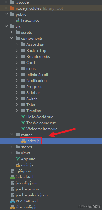
import { createRouter, createWebHistory } from 'vue-router'
import RightClickMenuView from '../views/RightClickMenuView.vue'
import RangePickerView from '../views/RangePickerView.vue'


const router = createRouter({
  history: createWebHistory(import.meta.env.BASE_URL),
  routes: [
    {
      path: '/',
      name: 'progress',
      component:  () => import('../views/ProgressView.vue'),
    },
    {
      path: '/tabs',
      name: 'tabs',
      // route level code-splitting
      // this generates a separate chunk (About.[hash].js) for this route
      // which is lazy-loaded when the route is visited.
      // 标签页(Tabs)
      component: () => import('../views/TabsView.vue'),
    },
    {
      path: '/accordion',
      name: 'accordion',
      // 折叠面板(Accordion)
      component: () => import('../views/AccordionView.vue'),
    },
    {
      path: '/timeline',
      name: 'timeline',
      // 时间线(Timeline)
      component: () => import('../views/TimelineView.vue'),
    },
    {
      path: '/backToTop',
      name: 'backToTop',
      component: () => import('../views/BackToTopView.vue')
    },
    {
      path: '/notification',
      name: 'notification',
      component: () => import('../views/NotificationView.vue')
    },
    {
      path: '/card',
      name: 'card',
      component: () => import('../views/CardView.vue')
    },
    {
      path: '/infiniteScroll',
      name: 'infiniteScroll',
      component: () => import('../views/InfiniteScrollView.vue')
    },
    {
      path: '/switch',
      name: 'switch',
      component: () => import('../views/SwitchView.vue')
    },
    {
      path: '/sidebar',
      name: 'sidebar',
      component: () => import('../views/SidebarView.vue')
    },
    {
      path: '/breadcrumbs',
      name: 'breadcrumbs',
      component: () => import('../views/BreadcrumbsView.vue')
    },
    {
      path: '/masonryLayout',
      name: 'masonryLayout',
      component: () => import('../views/MasonryLayoutView.vue')
    },
    {
      path: '/rating',
      name: 'rating',
      component: () => import('../views/RatingView.vue')
    },
    {
      path: '/datePicker',
      name: 'datePicker',
      component: () => import('../views/DatePickerView.vue')
    },
    {
      path: '/colorPicker',
      name: 'colorPicker',
      component: () => import('../views/ColorPickerView.vue')
    },
    {
      path: '/rightClickMenu',
      name: 'rightClickMenu',
      component: RightClickMenuView
    },
    {
      path: '/rangePicker',
      name: 'rangePicker',
      component: () => import('../views/RangePickerView.vue')
    },
    {
      path: '/navbar',
      name: 'navbar',
      component: () => import('../views/NavbarView.vue')
    },
    {
      path: '/formValidation',
      name: 'formValidation',
      component: () => import('../views/FormValidationView.vue')
    },
    {
      path: '/copyToClipboard',
      name: 'copyToClipboard',
      component: () => import('../views/CopyToClipboardView.vue')
    },
    {
      path: '/clickAnimations',
      name: 'clickAnimations',
      component: () => import('../views/ClickAnimationsView.vue')
    },
    {
      path: '/thumbnailList',
      name: 'thumbnailList',
      component: () => import('../views/ThumbnailListView.vue')
    },
    {
      path: '/keyboardShortcuts',
      name: 'keyboardShortcuts',
      component: () => import('../views/KeyboardShortcutsView.vue')
    },
    {
      path: '/commentSystem',
      name: 'commentSystem',
      component: () => import('../views/CommentSystemView.vue')
    },
    {
      path: '/qRCode',
      name: 'qRCode',
      component: () => import('../views/QRCodeView.vue')
    },
    {
      path: '/radioButton',
      name: 'radioButton',
      component: () => import('../views/RadioButtonView.vue')
    },
    {
      path: '/slider',
      name: 'slider',
      component: () => import('../views/SliderView.vue')
    },
    {
      path: '/scrollAnimations',
      name: 'scrollAnimations',
      component: () => import('../views/ScrollAnimationsView.vue')
    },
    {
      path: '/textInputView',
      name: 'textInputView',
      component: () => import('../views/TextInputView.vue')
    },
    {
      path: '/divider',
      name: 'divider',
      component: () => import('../views/DividerView.vue')
    },
    {
      path: '/checkbox',
      name: 'checkbox',
      component: () => import('../views/CheckboxView.vue')
    },
    {
      path: '/tagInput',
      name: 'tagInput',
      component: () => import('../views/TagInputView.vue')
    },
    {
      path: '/dropdownSelect',
      name: 'dropdownSelect',
      component: () => import('../views/DropdownSelectView.vue')
    },
    {
      path: '/list',
      name: 'list',
      component: () => import('../views/ListView.vue')
    },
    {
      path: '/header',
      name: 'header',
      component: () => import('../views/HeaderView.vue')
    },
    {
      path: '/footer',
      name: 'footer',
      component: () => import('../views/FooterView.vue')
    },
    {
      path: '/pagination',
      name: 'pagination',
      component: () => import('../views/PaginationView.vue')
    },
    {
      path: '/floatingActionButton',
      name: 'floatingActionButton',
      component: () => import('../views/FloatingActionButtonView.vue')
    },
    {
      path: '/gridLayout',
      name: 'gridLayout',
      component: () => import('../views/GridLayoutView.vue')
    },
    {
      path: '/passwordInput',
      name: 'passwordInput',
      component: () => import('../views/PasswordInputView.vue')
    },
    {
      path: '/flexbox',
      name: 'flexbox',
      component: () => import('../views/FlexboxView.vue')
    },
    {
      path: '/modal',
      name: 'modal',
      component: () => import('../views/ModalView.vue')
    },
    {
      path: '/richTextEditor',
      name: 'richTextEditor',
      component: () => import('../views/RichTextEditorView.vue')
    },
    {
      path: '/timePickerView',
      name: 'timePickerView',
      component: () => import('../views/TimePickerView.vue')
    }
  ],
})

export default router
📘编写展示入口 src\App.vue
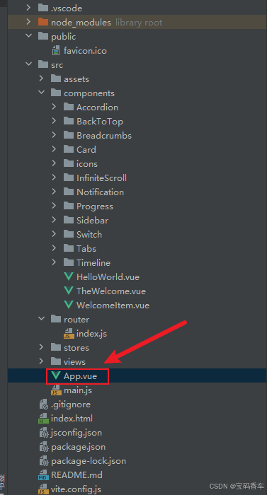
<script setup>
import { RouterLink, RouterView } from 'vue-router'
import HelloWorld from './components/HelloWorld.vue'
</script>

<template>
  <header>
    <img alt="Vue logo" class="logo" src="@/assets/logo.svg" width="125" height="125" />

    <div class="wrapper">
      <HelloWorld msg="You did it!" />
      <nav>
        <RouterLink to="/">Progress</RouterLink>
        <RouterLink to="/tabs">Tabs</RouterLink>
        <RouterLink to="/accordion">Accordion</RouterLink>
        <RouterLink to="/timeline">Timeline</RouterLink>
        <RouterLink to="/backToTop">BackToTop</RouterLink>
        <RouterLink to="/notification">Notification</RouterLink>
        <RouterLink to="/card">Card</RouterLink>
        <RouterLink to="/infiniteScroll">InfiniteScroll</RouterLink>
        <RouterLink to="/switch">Switch</RouterLink>
        <RouterLink to="/sidebar">Sidebar</RouterLink>
        <RouterLink to="/breadcrumbs">Breadcrumbs</RouterLink>
        <RouterLink to="/masonryLayout">MasonryLayout</RouterLink>
        <RouterLink to="/rating">Rating</RouterLink>
        <RouterLink to="/datePicker">DatePicker</RouterLink>
        <RouterLink to="/colorPicker">ColorPicker</RouterLink>
        <RouterLink to="/rightClickMenu">RightClickMenu</RouterLink>
        <RouterLink to="/rangePicker">RangePicker</RouterLink>
        <RouterLink to="/navbar">Navbar</RouterLink>
        <RouterLink to="/formValidation">FormValidation</RouterLink>
        <RouterLink to="/copyToClipboard">CopyToClipboard</RouterLink>
        <RouterLink to="/clickAnimations">ClickAnimations</RouterLink>
        <RouterLink to="/thumbnailList">ThumbnailList</RouterLink>
        <RouterLink to="/keyboardShortcuts">KeyboardShortcuts</RouterLink>
        <RouterLink to="/commentSystem">CommentSystem</RouterLink>
        <RouterLink to="/qRCode">QRCode</RouterLink>
        <RouterLink to="/radioButton">RadioButton</RouterLink>
        <RouterLink to="/slider">Slider</RouterLink>
        <RouterLink to="/scrollAnimations">ScrollAnimations</RouterLink>
        <RouterLink to="/textInputView">TextInput</RouterLink>
        <RouterLink to="/divider">Divider</RouterLink>
        <RouterLink to="/checkbox">Checkbox</RouterLink>
        <RouterLink to="/tagInput">TagInput</RouterLink>
        <RouterLink to="/dropdownSelect">DropdownSelect</RouterLink>
        <RouterLink to="/list">List</RouterLink>
        <RouterLink to="/header">Header</RouterLink>
        <RouterLink to="/footer">Footer</RouterLink>
        <RouterLink to="/pagination">Pagination</RouterLink>
        <RouterLink to="/floatingActionButton">FloatingActionButton</RouterLink>
        <RouterLink to="/gridLayout">GridLayout</RouterLink>
        <RouterLink to="/passwordInput">PasswordInput</RouterLink>
        <RouterLink to="/flexbox">Flexbox</RouterLink>
        <RouterLink to="/modal">Modal</RouterLink>
        <RouterLink to="/richTextEditor">RichTextEditor</RouterLink>
        <RouterLink to="/timePickerView">TimePickerView</RouterLink>
      </nav>
    </div>
  </header>
  <RouterView />
</template>

<style scoped>
header {
  line-height: 1.5;
  max-height: 100vh;
}

.logo {
  display: block;
  margin: 0 auto 2rem;
}

nav {
  width: 100%;
  font-size: 12px;
  text-align: center;
  margin-top: 2rem;
}

nav a.router-link-exact-active {
  color: var(--color-text);
}

nav a.router-link-exact-active:hover {
  background-color: transparent;
}

nav a {
  display: inline-block;
  padding: 0 1rem;
  border-left: 1px solid var(--color-border);
}

nav a:first-of-type {
  border: 0;
}

@media (min-width: 1024px) {
  header {
    display: flex;
    place-items: center;
    padding-right: calc(var(--section-gap) / 2);
  }

  .logo {
    margin: 0 2rem 0 0;
  }

  header .wrapper {
    display: flex;
    place-items: flex-start;
    flex-wrap: wrap;
  }

  nav {
    text-align: left;
    margin-left: -1rem;
    font-size: 1rem;

    padding: 1rem 0;
    margin-top: 1rem;
  }
}
</style>
📚页面效果
到此这篇文章就介绍到这了,更多精彩内容请关注本人以前的文章或继续浏览下面的文章,创作不易,如果能帮助到大家,希望大家多多支持宝码香车~💕,若转载本文,一定注明本文链接。


脑启社区是一个专注类脑智能领域的开发者社区。欢迎加入社区,共建类脑智能生态。社区为开发者提供了丰富的开源类脑工具软件、类脑算法模型及数据集、类脑知识库、类脑技术培训课程以及类脑应用案例等资源。
更多推荐

 31
31 0
0- 0


 已为社区贡献5条内容

所有评论(0)