DAY 32 官方文档的阅读
本文以鸢尾花三分类项目为例,演示如何通过官方文档快速掌握pdpbox库的使用方法。重点介绍了:1)官方文档检索的三种途径;2)TargetPlot类的使用流程,包括实例化参数(init)和plot方法解析;3)返回值处理技巧,揭示其返回(fig,axes,summary_df)三元组结构。通过具体案例展示了如何根据文档提示调整可视化参数,包括图表尺寸、标题位置等属性设置。最后强调使用新库时需要重点
知识点回顾:
- 官方文档的检索方式:github和官网
- 官方文档的阅读和使用:要求安装的包和文档为同一个版本
- 类的关注点:
- 实例化所需要的参数
- 普通方法所需要的参数
- 普通方法的返回值
- 绘图的理解:对底层库的调用
我们已经掌握了相当多的机器学习和python基础知识,现在面对一个全新的官方库,看看是否可以借助官方文档的写法了解其如何使用。
我们以pdpbox这个机器学习解释性库来介绍如何使用官方文档。
大多数 Python 库都会有官方文档,里面包含了函数的详细说明、用法示例以及版本兼容性信息。
通常查询方式包含以下3种:
- GitHub 仓库:https://github.com/SauceCat/PDPbox
- PyPI 页面:https://pypi.org/project/PDPbox/
- 官方文档:https://pdpbox.readthedocs.io/en/latest/
一般通过github仓库都可以找到对应的官方文档,在官方文档中搜索函数名,然后查看函数的详细说明和用法示例
以pdpbox库为例:
# pip install pdpbox scikit-learn pandas plotly
# pip install pdpbox --upgrade  # 升级pdpbox
下面以鸢尾花三分类项目来演示如何查看官方文档
import pandas as pd
from sklearn.datasets import load_iris
from sklearn.model_selection import train_test_split
from sklearn.ensemble import RandomForestClassifier


# 加载鸢尾花数据集
iris = load_iris()
df = pd.DataFrame(iris.data, columns=iris.feature_names)
df['target'] = iris.target  # 添加目标列(0-2类:山鸢尾、杂色鸢尾、维吉尼亚鸢尾)

# 特征与目标变量
features = iris.feature_names  # 4个特征:花萼长度、花萼宽度、花瓣长度、花瓣宽度
target = 'target'  # 目标列名

# 划分训练集与测试集
X_train, X_test, y_train, y_test = train_test_split(
    df[features], df[target], test_size=0.2, random_state=42
)

# 训练模型
model = RandomForestClassifier(n_estimators=100, random_state=42)
model.fit(X_train, y_train)
此时模型已经建模完毕,这是一个经典的三分类项目。
现在我们开始对这个模型进行解释性分析:
先进入官方文档pdpbox,pdpbox这个库比较小,所以非常适合我们学习用法。
在官方文档中,通常会有一个“API Reference”或“Documentation”部分,列出所有可用的函数、类和方法。
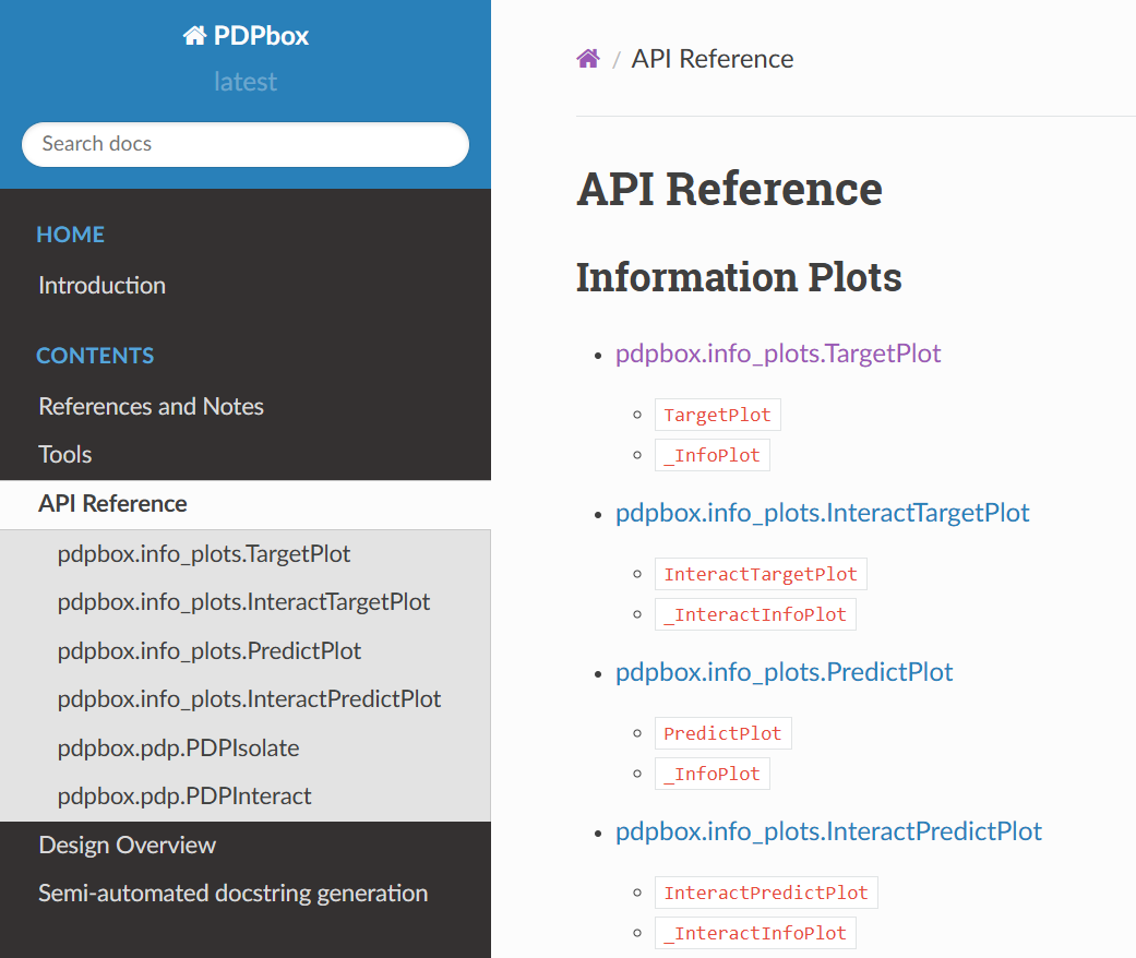
选择第一个图pdpbox.info_plots.TargetPlot进行绘制
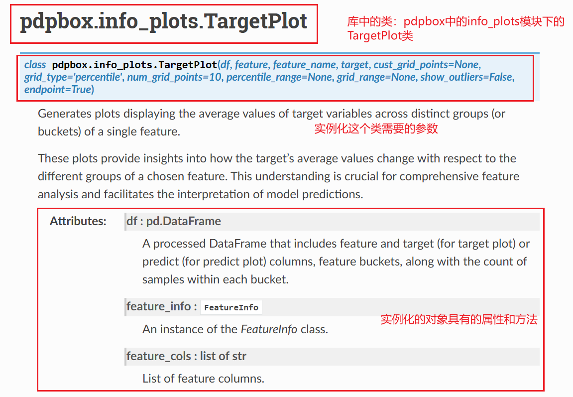
现在我们第一步是实例化这个类,TargetPlot类,确保安装的最新版本的库 (库名.__version__)
- 先导入这个类(三种不同的导入和引用方法)
- 传入实例化参数
import  pdpbox
from pdpbox.info_plots import TargetPlot # 导入TargetPlot类可以鼠标悬停在这个类上,来查看定义这个类所需要的参数,以及每个参数的格式,ctrl进入可以查看这个类的详细信息
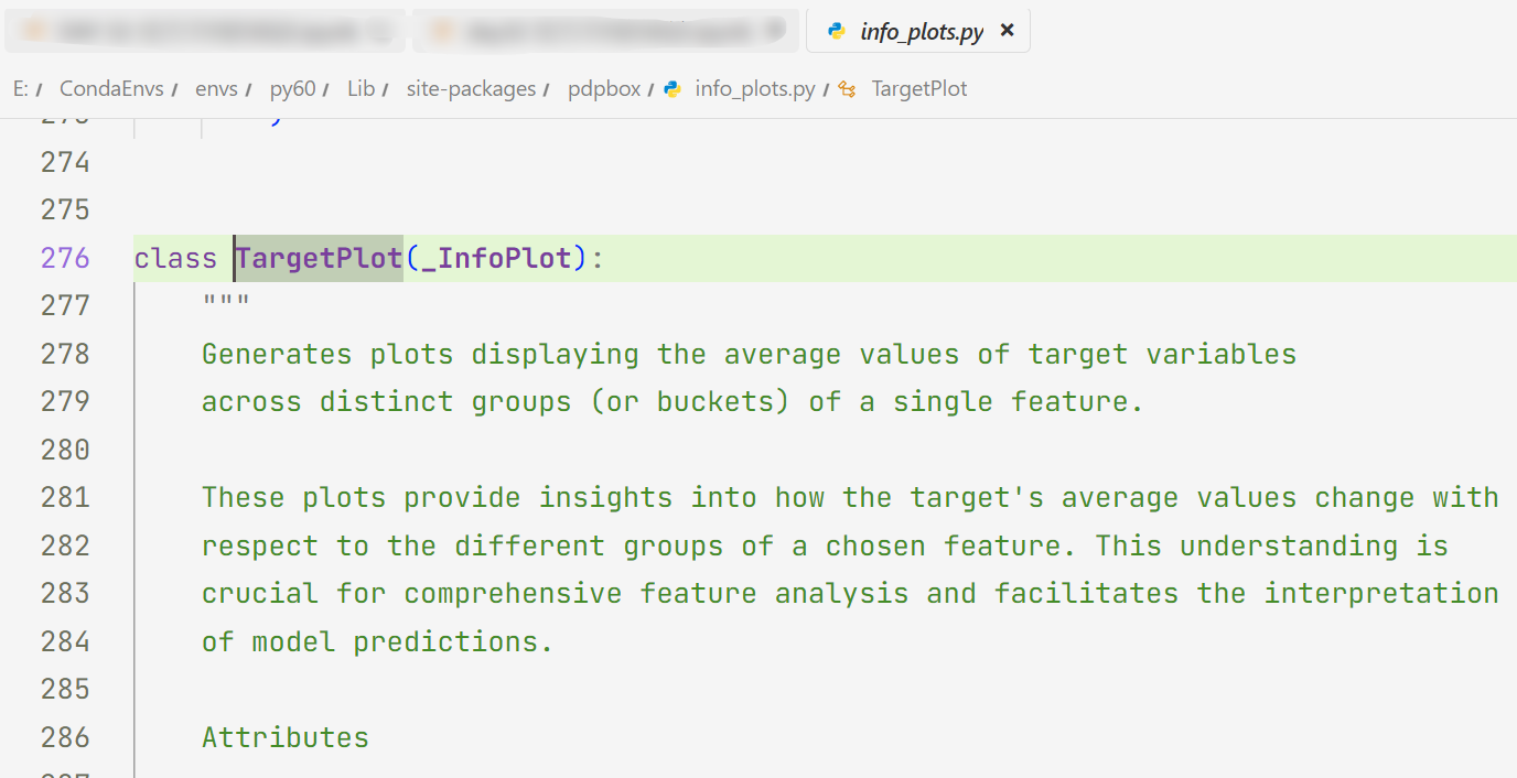
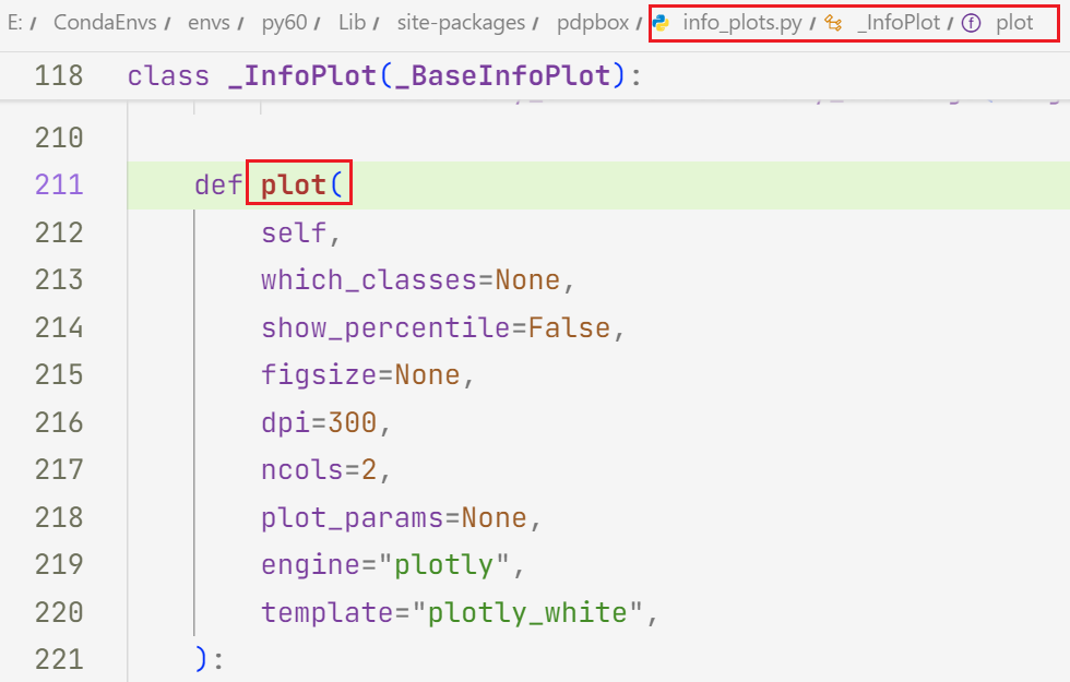
只能查看到他的初始化方法 __init__( ),但是无法看到他的普通方法。从提示中发现是有 plot( ) 方法的,但是看不到这个普通方法需要传入的参数;
但是发现 TargetPlot 类继承了_InfoPlot 类,此时我们再次进入 _InfoPlot 类里面,就顺利找到了这个继承的 plot() 方法及其参数。
plot( ):生成 目标特征对模型预测结果影响的可视化图表
初始化TargetPlot对象并绘图
# 选择待分析的特征(如:petal length (cm))
feature = 'petal length (cm)'
feature_name = feature  # 特征显示名称

# 初始化TargetPlot对象(移除plot_type参数)
target_plot = TargetPlot(
    df=df,  # 原始数据(需包含特征和目标列)
    feature=feature,  # 目标特征列
    feature_name=feature_name,  # 特征名称(用于绘图标签)
    target='target',  # 多分类目标索引(鸢尾花3个类别)
    grid_type='percentile',  # 分桶方式:百分位
    num_grid_points=10  # 划分为10个桶
)
# 调用plot方法绘制图形
target_plot.plot()输出:
(Figure({
     'data': [{'hovertemplate': '%{text}',
               'marker': {'color': '#5BB573', 'opacity': 0.5},
               'name': 'count',
               'text': array([11., 13., 26., 16., 13., 20., 17., 15., 19.]),
               'textposition': 'outside',
               'type': 'bar',
               'width': 0.36,
               'x': array([0, 1, 2, 3, 4, 5, 6, 7, 8], dtype=int64),
               'xaxis': 'x',
               'y': array([11, 13, 26, 16, 13, 20, 17, 15, 19], dtype=int64),
               'yaxis': 'y'},
              {'hovertemplate': '%{text}',
               'line': {'color': '#636EFA'},
               'marker': {'color': '#636EFA'},
               'mode': 'lines+markers+text',
               'name': 'Average target',
               'text': [0.0, 0.0, 0.0, 1.0, 1.0, 1.15, 1.765, 2.0, 2.0],
               'textposition': 'top center',
               'type': 'scatter',
               'x': array([0, 1, 2, 3, 4, 5, 6, 7, 8], dtype=int64),
               'xaxis': 'x',
               'y': array([0.        , 0.        , 0.        , 1.        , 1.        , 1.15      ,
                           1.76470588, 2.        , 2.        ]),
               'yaxis': 'y2'}],
     'layout': {'height': 600,
                'showlegend': False,
                'template': '...',
                'title': {'text': ('Target plot for feature <b>pet' ... 'ifferent feature values.</sup>'),
                          'x': 0,
                          'xref': 'paper'},
                'width': 1200,
                'xaxis': {'anchor': 'y',
                          'domain': [0.0, 1.0],
                          'ticktext': [[1.0, 1.4), [1.4, 1.5), [1.5, 2.63), [2.63,
                                       4.1), [4.1, 4.5), [4.5, 4.9), [4.9, 5.19),
                                       [5.19, 5.7), [5.7, 6.9]],
                          'tickvals': array([0, 1, 2, 3, 4, 5, 6, 7, 8]),
                          'title': {'text': '<b>petal length (cm)</b> (value)'}},
                'yaxis': {'anchor': 'x', 'domain': [0.0, 0.98], 'range': [0, 31.2], 'title': {'text': 'count'}},
                'yaxis2': {'anchor': 'x',
                           'domain': [0.0, 0.98],
                           'overlaying': 'y',
                           'range': [0, 2.4],
                           'showgrid': False,
                           'side': 'right',
                           'title': {'text': 'Average target'}}}
 }),
 None,
    x        value      percentile  count    target
 0  0   [1.0, 1.4)    [0.0, 11.11)     11  0.000000
 1  1   [1.4, 1.5)  [11.11, 22.22)     13  0.000000
 2  2  [1.5, 2.63)  [22.22, 33.33)     26  0.000000
 3  3  [2.63, 4.1)  [33.33, 44.44)     16  1.000000
 4  4   [4.1, 4.5)  [44.44, 55.56)     13  1.000000
 5  5   [4.5, 4.9)  [55.56, 66.67)     20  1.150000
 6  6  [4.9, 5.19)  [66.67, 77.78)     17  1.764706
 7  7  [5.19, 5.7)  [77.78, 88.89)     15  2.000000
 8  8   [5.7, 6.9]  [88.89, 100.0]     19  2.000000)
输出的并不是图像,尝试查看下输出结果的类型:
# 看起来很奇怪,我们查看下类型
type(target_plot.plot())
输出:
tuple查看长度
len(target_plot.plot()) # 查看元组的形状,元组只有len方法,没有shape方法输出:
3依次查看元组的3个元素是什么:
target_plot.plot()[0]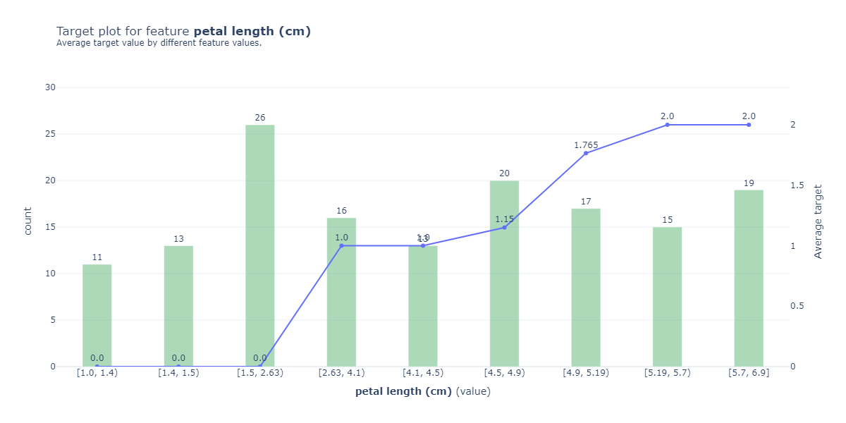
target_plot.plot()[1]
# 啥也没有
type(target_plot.plot()[1])
# 无类型。。。输出:
NoneTypetarget_plot.plot()[2]输出:
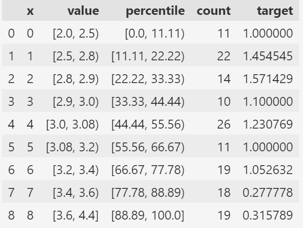
第三个元素返回的是目标变量(或预测值)在不同特征区间的统计摘要。这是 PDPbox(Partial Dependence Plot) 库生成的核心分析数据。他已经在图上被可视化出来了
实际上,返回的是一个三元组 (fig, axes, summary_df),其中 fig 是 Plotly 的 Figure 对象。
要查看或修改图形的形状(如宽度、高度、边距等),可以直接操作这个 Figure 对象。
在官方文档介绍中的 plot方法 最下面,写明了参数和对应的返回值
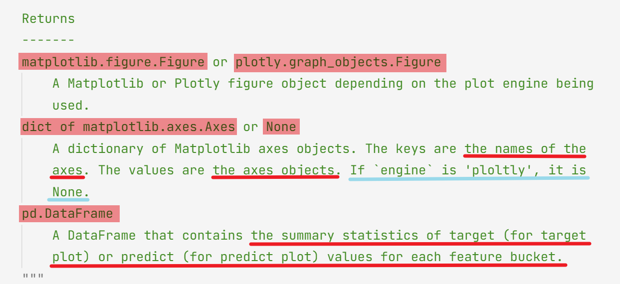
综上需要注意,我们关注一个类需要关注如下信息:
- 传入的参数和对应的格式
- 类对应的方法的返回值
最后,用规范的形式来完成绘图:
fig, axes, summary_df = target_plot.plot(
    which_classes=None,  # 绘制所有类别(0,1,2)
    show_percentile=True,  # 显示百分位线
    engine='plotly',
    template='plotly_white'
)

# 手动设置图表尺寸(单位:像素)
fig.update_layout(
    width=800,  # 宽度800像素
    height=500,  # 高度500像素
    title=dict(text=f'Target Plot: {feature_name}', x=0.5)  # 居中标题
)

fig.show()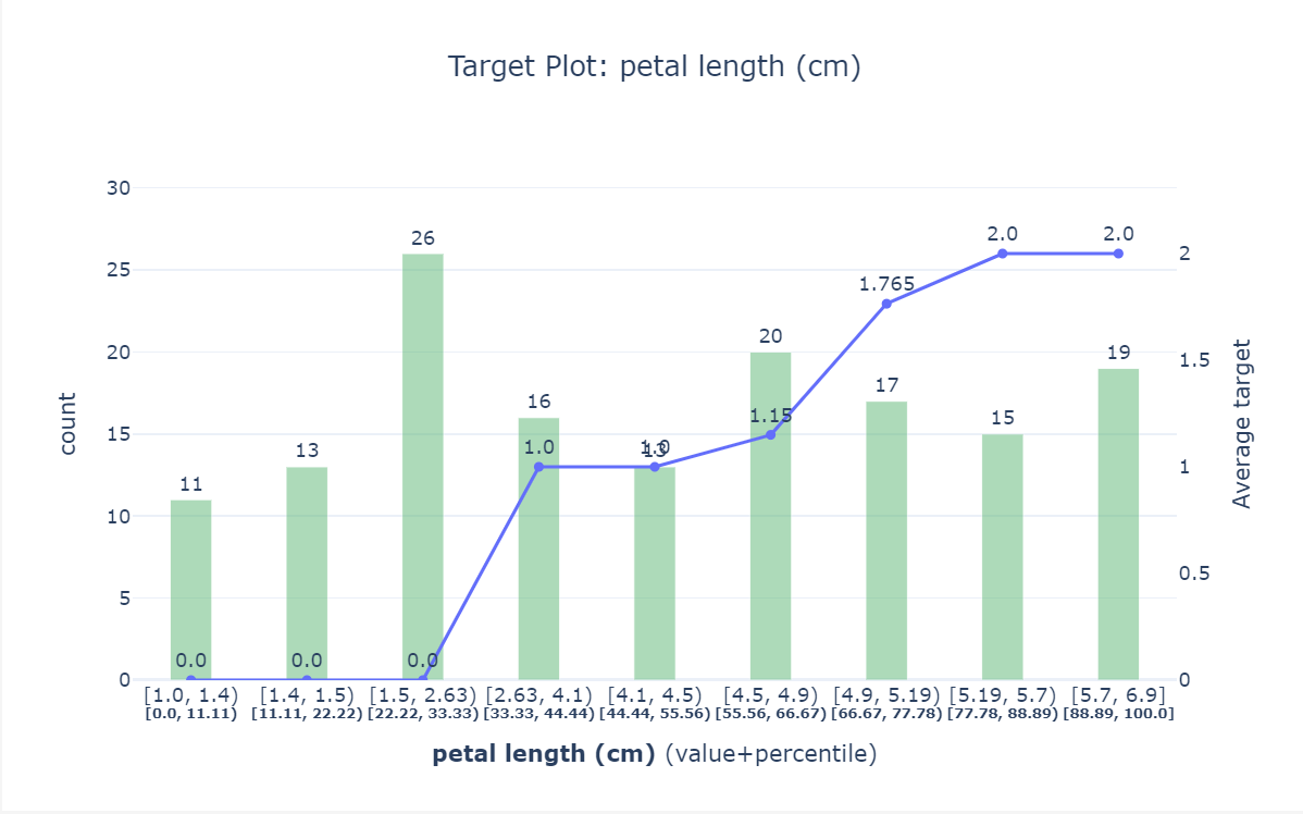

脑启社区是一个专注类脑智能领域的开发者社区。欢迎加入社区,共建类脑智能生态。社区为开发者提供了丰富的开源类脑工具软件、类脑算法模型及数据集、类脑知识库、类脑技术培训课程以及类脑应用案例等资源。
更多推荐

 21
21 0
0- 0


 已为社区贡献5条内容

所有评论(0)